Healthy Should Be Simple
Scan
HealthPartners had a negative perception problem. 19% of consumers viewed the brand unfavorably. Worse, brand-tracking showed consumers couldn’t tell healthcare brands apart at all. Too many smiling doctors and a lot of blue in every ad. Even HealthPartners’ own members couldn't articulate why they stayed with them.
Spot
Moms are the ones making 91% of family healthcare decisions, and they are busy. They have zero patience for complicated healthcare and will gravitate toward the one that makes the most sense.
.jpg)
Rally
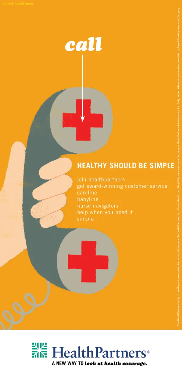
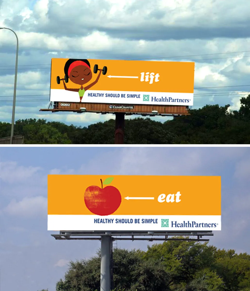
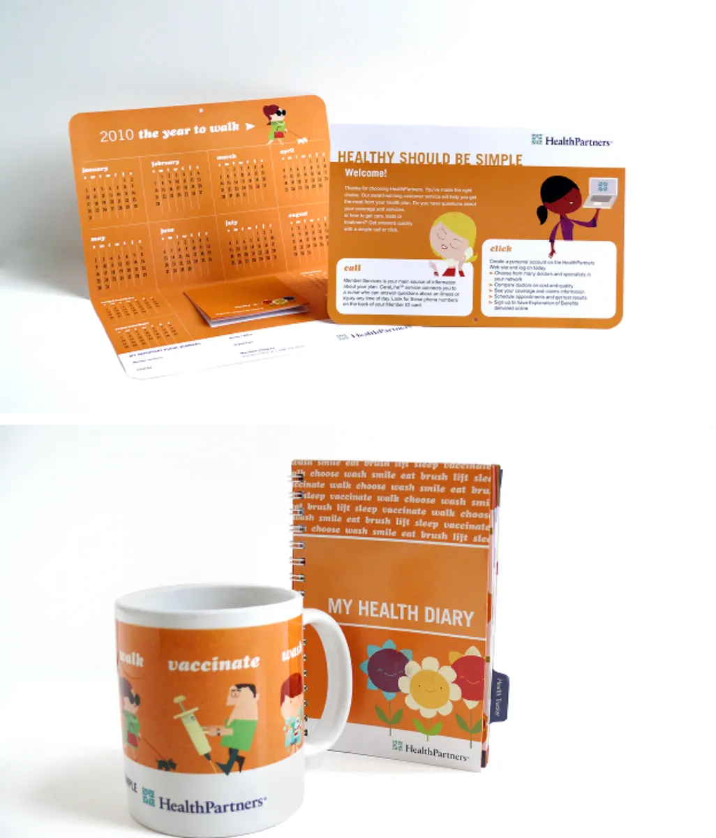
A campaign called “Healthy Should Be Simple” was built on a show-don't-tell philosophy. Messaging around the simple ways to stay healthy met consumers where they were, with tissue dispensers in malls, hand sanitizer stations in high-traffic venues, fresh apples handed out by street teams, and gerbera daisies improving air quality in clinics. A London-based illustrator gave HealthPartners a warm, distinct visual identity, ditching the ubiquitous blue of healthcare advertising and leaning into warm colors instead.