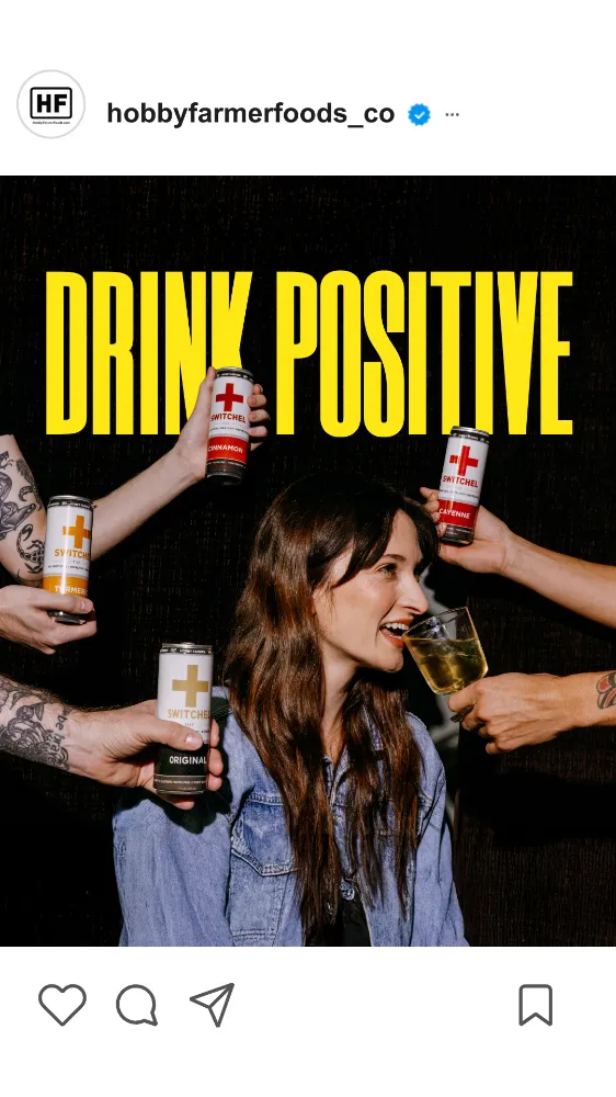
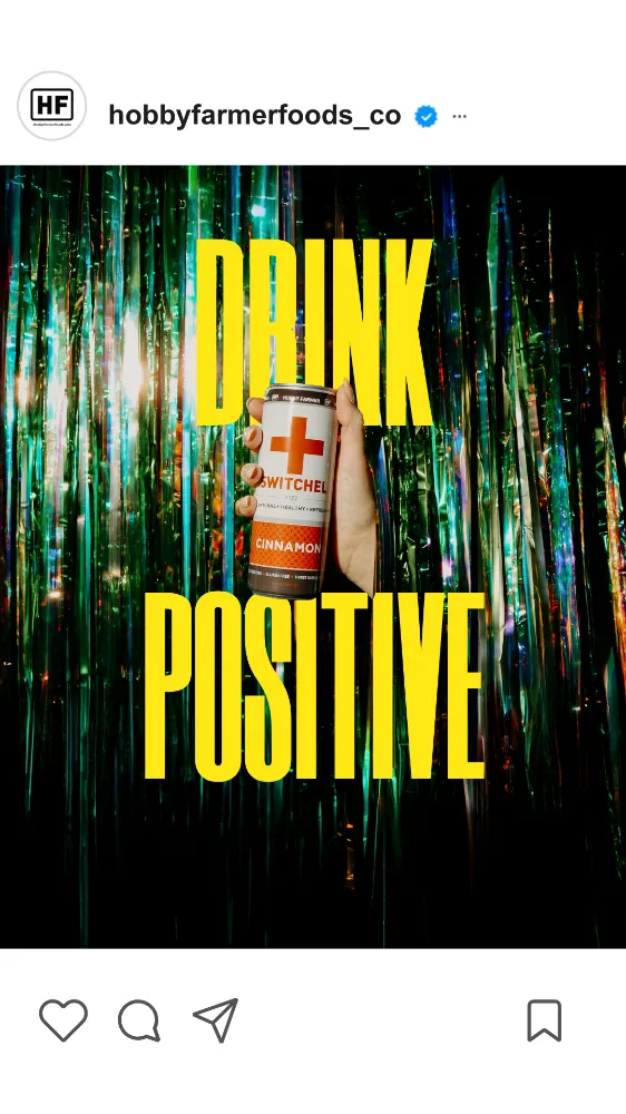
Drink Positive
Spot
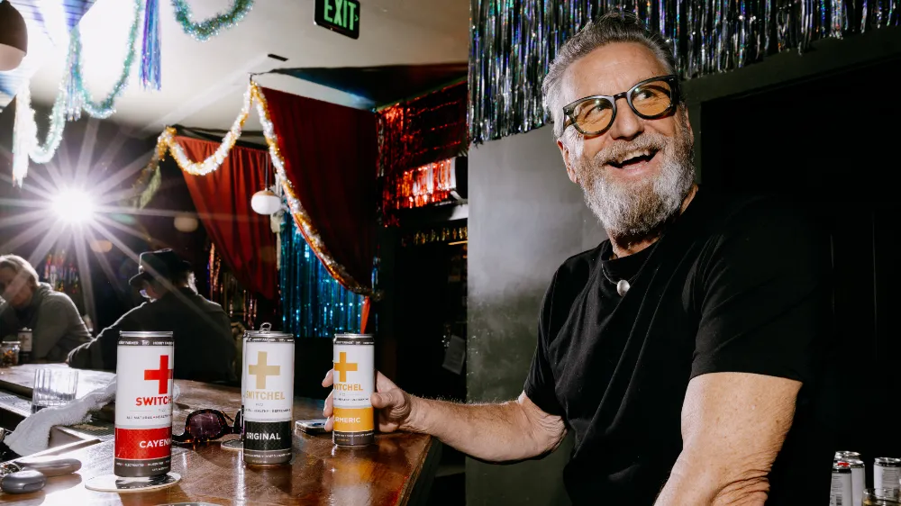
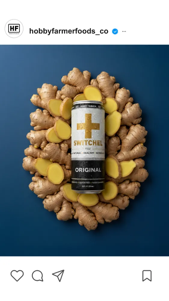
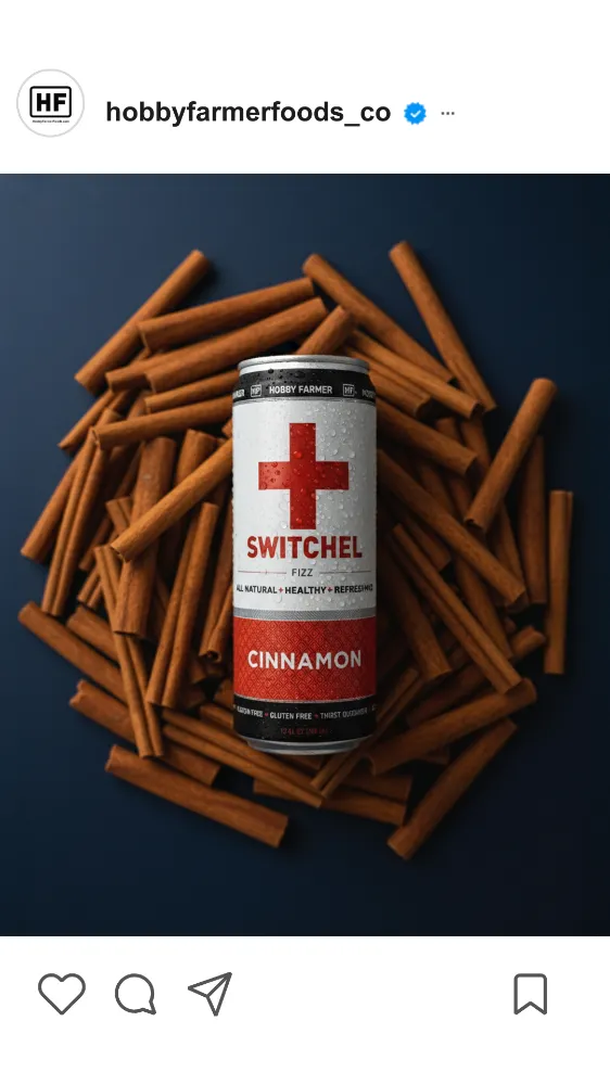
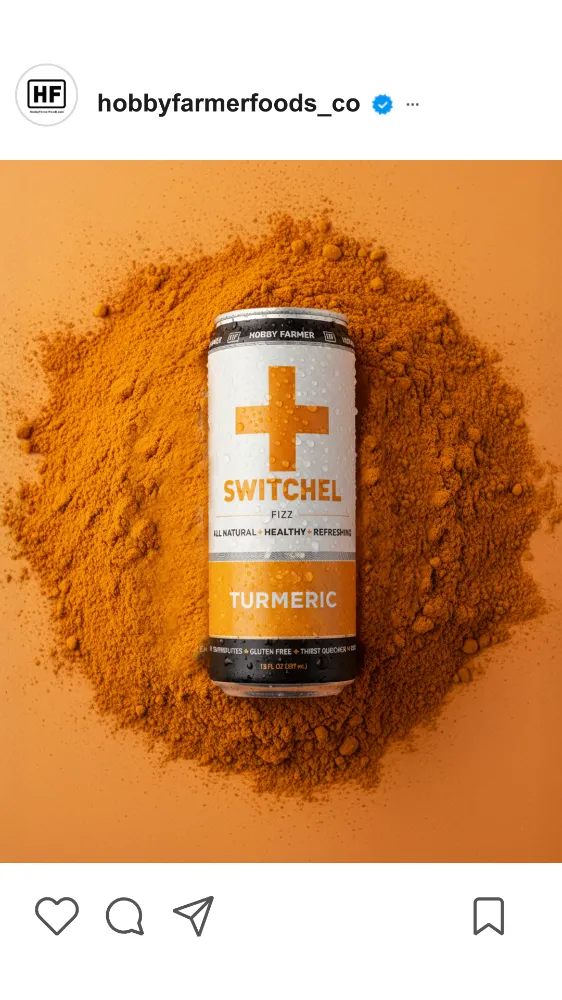
Hobby Farmer Switchel had an award-winning product, a genuine rock-star founder story, and ingredients that actually made people feel better. But without a clear position or consistent visual language, all of it was scattered. The authenticity was real but not flowing together.
Scan
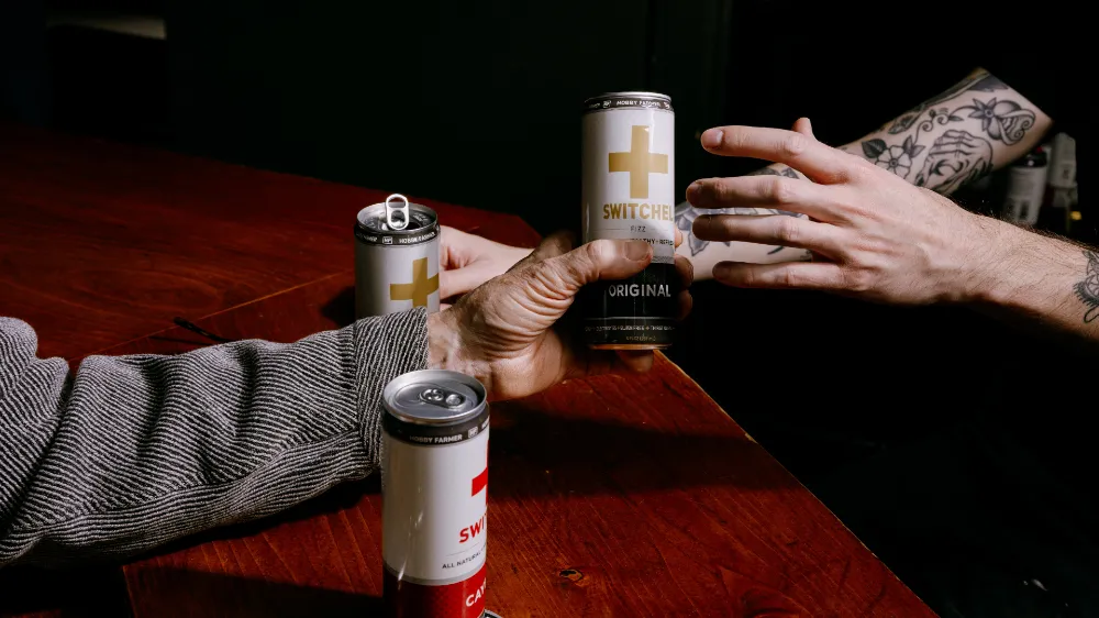
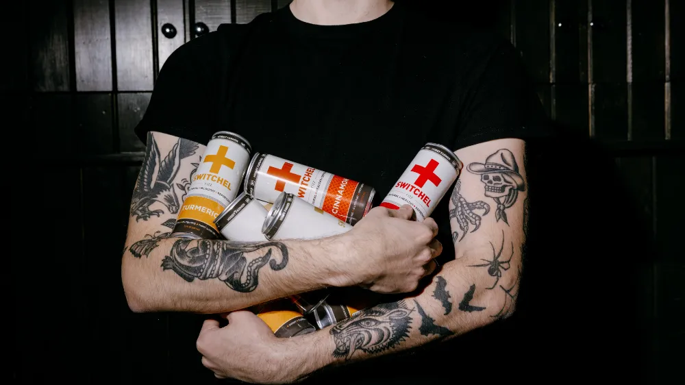
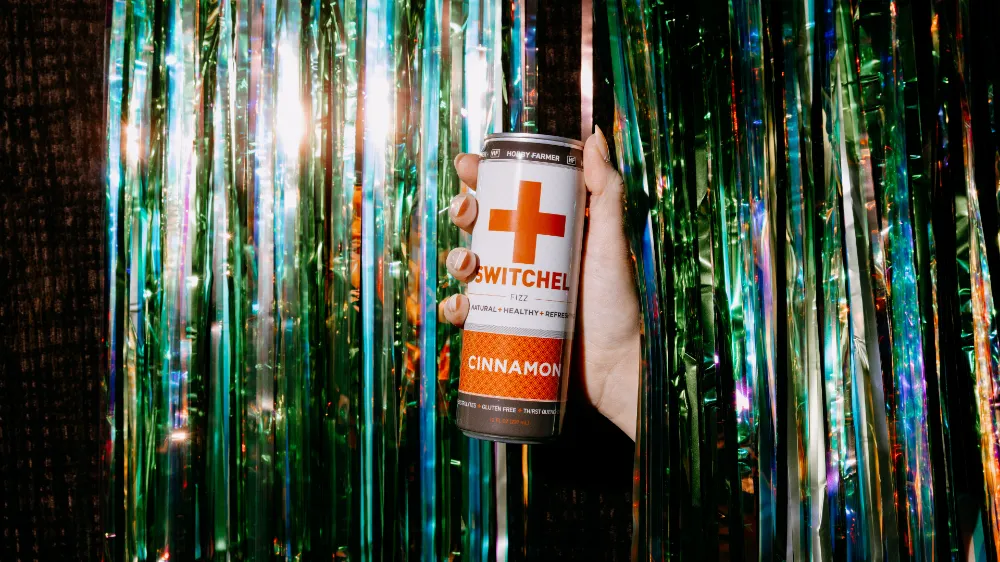
The positivity was already in the sip. All-natural, prebiotic, anti-inflammatory, energy-boosting, gut-friendly. It even has a literal + sign on the can. The brand was already the most optimistic drink in the cooler. It just didn’t know it yet (and neither did its thirsty audience).
Rally
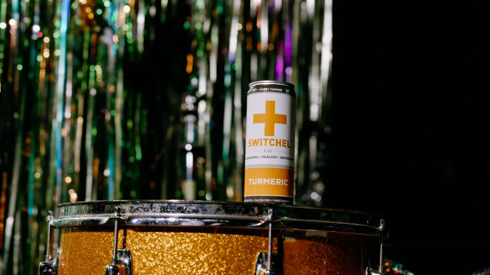
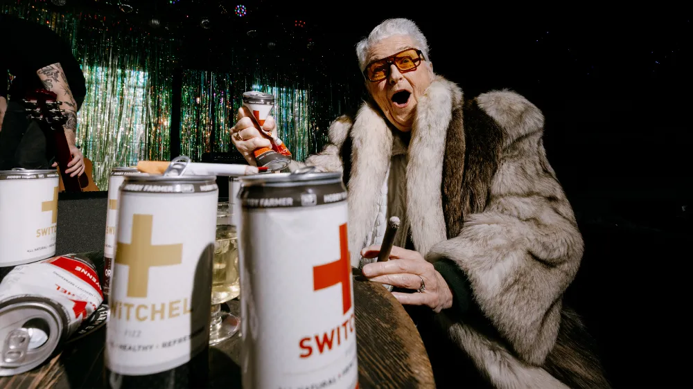
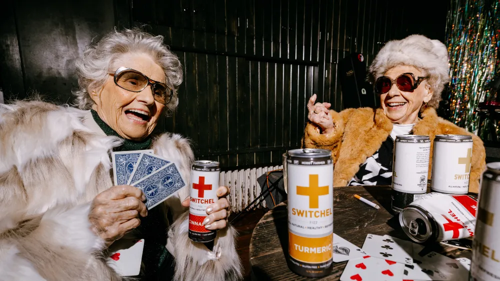
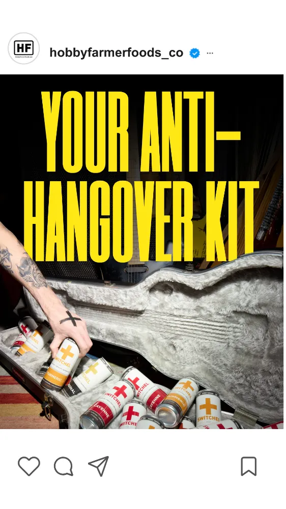
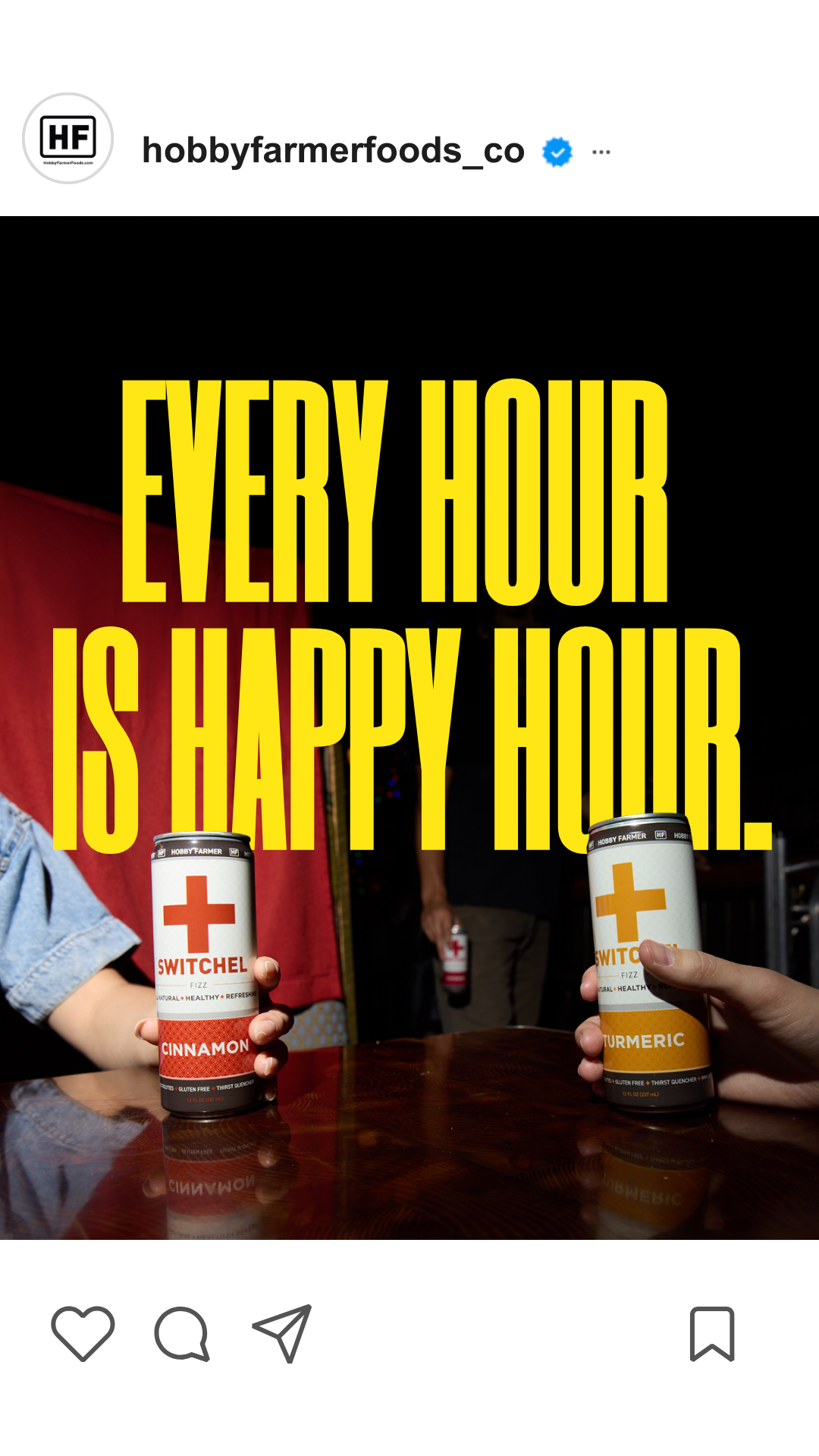
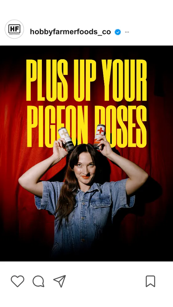
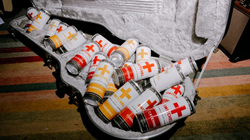
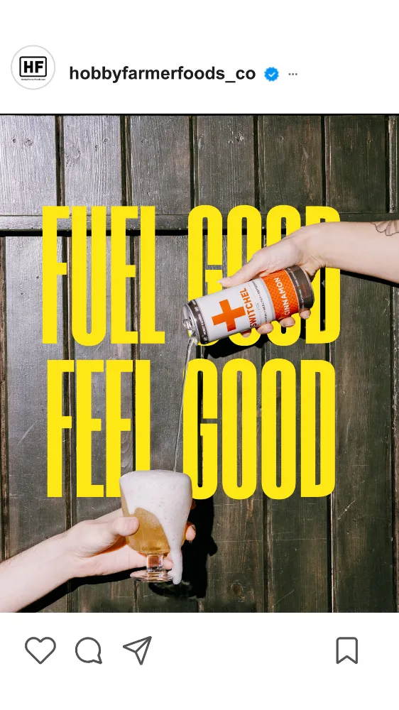
A visual design toolkit gave the brand a consistent look wherever it showed up: Instagram, farmer’s market popups, retail shelves. And a “Drink Positive” campaign aligned messaging and voice. Switchel finally looked and sounded as good as it actually is.